Ekoï aims to enable every cycling enthusiast, whether a recreational rider or a competitor, to access equipment that is high-performing, comfortable, good-looking, and affordable, by building a brand that is honest, human, and straightforward, rooted in a passion for cycling and in the demands of real-world riding.
The C12 must combine:
-
Performance
-
A visually striking, sleek, race-ready design
-
Clear functional or aesthetic innovation
-
An explicit and confident EKOI identity
Develop a high-end road shoe capable of competing with the best on the market and establishing itself as the top-performing shoe in the EKOI range.
Technical requirements:
-
Ultra-lightweight: < 200 g (vs 240 g)
-
Optimised carbon outsole for the best possible stiffness/weight ratio
-
Excellent foot support: precise, stable tightening, BOA or an alternative system
-
Absolute comfort: no pressure points, an even, consistent fit
Development axes:
-
Create a desirable design
-
Introduce a visible, functional innovation to establish a strong signature
-
Reinforce EKOI’s ambition with a shoe that is bolder, more recognizable, and truly distinctive


Determination
Discipline
Uniqueness
Efficiency
High standards
Authenticity
Measurable performance
Reliability
Technical comfort

Adj. Latin word meaning “higher” or “more elevated.”
which evokes the drive toward elevation and continuous progress. It embodies the ambition to go
beyond one’s own limits and the aspiration to reach what is greatest.
DESIGN
DIRECTION


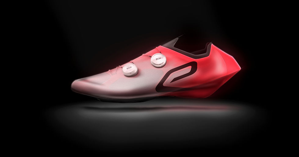
I draw inspiration from running brands to bring their performance codes into cycling footwear, speed, visual lightness, airflow, and a forward-driven tension.
The goal is to break away from the archetype of the classic cycling shoe, often bulky and static, and move toward an object that feels more dynamic, almost in motion, even when standing still.
Their approach to branding also inspires me. They use a strong, highly visible icon, scaled up, and always placed in the same position.
An icon is immediately recognizable, even in motion.


A laser-cut internal exoskeleton to stiffen the upper with minimal material, while keeping the structure open for ventilation and weight reduction.
_an internal strap running from the heel to the forefoot, forming the tongue and secured by a lateral lace keeper loop.
_a full upper wrap that also functions as a strap, secured by a medial lace keeper loop.